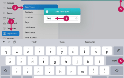
Getting Started
Step 23
Review Dashboards
Dashboards give you a graphical way to review your productivity and upcoming workload. There are over 25 dashboards you can see with one or two taps or clicks.
The Dashboard Directory lists the different dashboards and groups them by area of focus. These areas of focus include Overdue, Due Today, Priorities By Day, Open Tasks by Due Date, Task Breakdowns, and Completed Tasks.
Overdue
In the screenshot below, we will use the first Dashboard Group titled Overdue, as an example.

1 – This is the Dashboard Directory section. It lists the available dashboards and groups them by area of focus.
2 – This is the dashboard area and displays the dashboard you have selected.
3 – This is the toggle button for a dashboard group. You can tap or click on in to display the dashboard available in that group. The toggle arrow will be down when the group is opened. You can close the group by tapping or clicking the button again or by tapping or clicking on another dashboard group’s toggle button.
4 – This is the list of dashboards within the selected Dashboard Group.
5 – This is the toggle button for another Dashboard Group. The arrow is pointing to the right which indicates the group is currently closed. Tapping or clicking on the closed arrow will open it and display the individual dashboards within it.
In the screenshot above, there are 4 dashboards available for Overdue. These include:
- Overdue By Importance
- Overdue By Urgency
- Overdue By Impact
- Overdue By Effort
Each of these will graphically show the number of tasks overdue by each of the 5 priority levels.
Due Today
The next Dashboard Group is titled Due Today.
This group includes four dashboards that show a bar chart with the number of tasks due today by priority level. The four dashboards include one dashboard each for Importance, Urgency, Impact, and Effort.
In the example below, the Dashboard titled Due Today By Impact is shown. This dashboard graphically shows the number of tasks due today for the priority category you’ve selected (in this case, Impact).

Priorities By Day
The next Dashboard Group is titled Priorities By Day.
This group includes four dashboards that show a stacked bar chart with the number of tasks due each day by priority level for the next 14 days. The four dashboards include one dashboard each for Importance, Urgency, Impact, and Effort.
In the example below, the Dashboard titled Importance By Day is shown. This dashboard graphically shows the number of tasks due each for the next 14 days. For each day, you’ll see the number of tasks for each priority level (in this case, Importance Level) stacked on top of each other.

Open Tasks By Due Date
The next Dashboard Group is titled Open Tasks By Due Date.
This group currently only includes one dashboard that shows a bar chart with the number of tasks due each day for the next 14 days.
In this example, the Dashboard titled Open Tasks By Due Date is shown. This dashboard graphically shows the number of tasks due each day for the next 14 days.

Task Breakdowns
The next Dashboard Group is titled Task Breakdowns.
This group includes eleven (11) dashboards that show a pie chart with the percentage of open tasks due each day by priority level – highest, major, medium, some, and low. The eleven dashboards include one dashboard each for Importance, Urgency, Impact, and Effort as well as by the Organizers for Task Type, Location, Context, Tags, List Group, Task Status, and Persona.
In the example below, the Dashboard titled Task Breakdown By Importance is shown. This dashboard is a pie chart that graphically shows the percentage of open tasks for each of the importance levels.

Completed Tasks
The next Dashboard Group is titled Completed Tasks.
This group includes four (4) dashboards that show a bar chart related to the number of completed tasks completed. The four (4) dashboards include:
- Completed Tasks by Day
- Completed Tasks by Week
- Completed Tasks by Month
- Tasks Completed by Day Of Week
In the example below, the Dashboard titled Tasks Completed By Day of Week for the last year is shown. This dashboard is a bar chart that graphically shows the number of completed tasks for each of day of the week (Sunday – Saturday). There are a set of buttons at the top of the dashboard to select the timeframe you’re interested in – 30 days, 60 days, 180 days, or 1 year.